
You’ve spent hours picking out furniture. The color palette looked gorgeous on Pinterest. You even bought those throw pillows the influencer recommended. But your room still doesn’t look “right.”
Something feels off, and you can’t pinpoint what it is.
Here’s the thing most people never learn: the difference between a room that looks “decorated” and one that looks “designed” comes down to seven fundamental principles. Professional designers don’t have a magic eye. They have a framework — and once you understand it, you’ll start seeing exactly why some rooms feel effortlessly polished while others feel like a beautiful mess.
This guide breaks down each of the seven interior design principles in plain language. But we’re not stopping at definitions. You’ll get practical tips to apply each principle today, common mistakes to avoid, and a room diagnostic framework you can use to figure out exactly what’s going wrong in any space.
Let’s fix your room.
What Are Interior Design Principles?
Interior design principles are the foundational guidelines that professional designers use to create spaces that are visually balanced, functionally comfortable, and aesthetically cohesive. They’re the “grammar rules” of design — the invisible structure that holds a beautiful room together. You don’t need to memorize them like a textbook, but understanding them will transform how you see (and arrange) every room in your home.
There are seven core principles of interior design:
- Balance – Distributing visual weight evenly across a space
- Unity & Harmony – Making all elements feel like they belong together
- Rhythm – Creating visual movement that guides the eye through a room
- Emphasis – Establishing a focal point that anchors the space
- Proportion & Scale – Sizing objects correctly for the room and for each other
- Contrast – Using differences in color, texture, or shape to create visual energy
- Details – The finishing touches that elevate a room from good to memorable
Think of it this way: the elements of design (color, texture, line, light, space, form, pattern) are your ingredients. The principles of interior design are the recipe that tells you how to combine them. You can have the most beautiful ingredients in the world, but without the right recipe, the result will be disappointing.
Now let’s break each one down — with examples you can actually use.
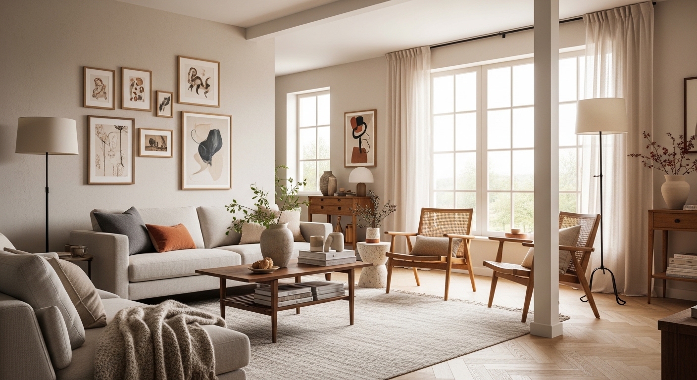
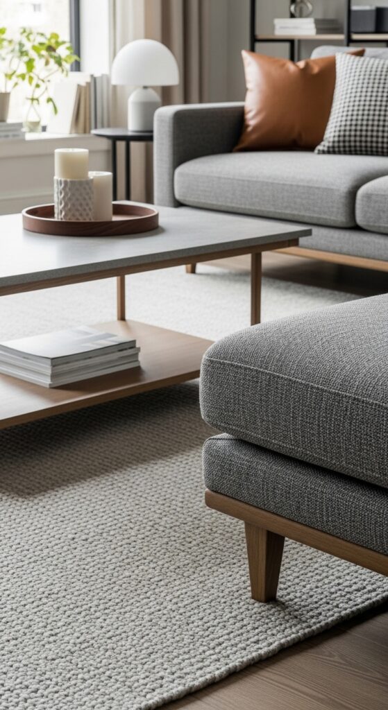
1. Balance: The Foundation of Every Well-Designed Room
Balance is the single most intuitive design principle. You can feel it before you can name it. Walk into a room where everything is shoved against one wall and the other side is bare — your brain immediately registers that something is wrong. That discomfort? It’s imbalance.
In interior design, balance refers to how visual weight is distributed across a space. It doesn’t mean everything has to match or be perfectly symmetrical. It means the room should feel stable, like no single area is pulling all the attention while the rest feels neglected.
Three Types of Balance
Symmetrical (Formal) Balance is the simplest approach. Picture two identical nightstands flanking a bed, or matching armchairs on either side of a fireplace. It’s clean, orderly, and works beautifully in traditional spaces. The risk? If you rely on it too heavily, the room can feel stiff and predictable — like a hotel lobby instead of a home.
Asymmetrical (Informal) Balance is where things get interesting. Instead of mirroring each side, you balance different objects of similar visual weight. A tall floor lamp on one side of a sofa balanced by a chunky side table with a stack of books on the other. This approach feels more relaxed and modern — and it’s how most professionally designed rooms achieve that effortless look.
Radial Balance arranges elements around a central point. Think of a round dining table with chairs evenly placed around it, or a chandelier hanging over a circular coffee table. It naturally draws the eye to the center and works especially well in entryways and dining areas.
Quick Fix for Balance
Stand in the doorway of your room and squint. Seriously. Squinting blurs the details and lets you see the overall distribution of “weight” — dark objects, large furniture, dense textures. If one side feels noticeably heavier, move a substantial object (a floor lamp, a large plant, a stack of books) to the lighter side. You’ll feel the shift immediately.
Common Mistake
Pushing all your furniture against the walls. It creates a ring of visual weight around the edges and dead space in the middle. Pull pieces away from the walls — even by just a few inches — and the room will instantly feel more balanced and inviting.
2. Unity & Harmony: Making a Room Feel “Put Together”
Ever walked into a room and thought, “This just works”? That’s harmony. Every piece of furniture, every color, every texture feels like it belongs. Nothing jars. Nothing sticks out for the wrong reasons.
Unity in interior design means all your elements connect through a shared thread — a consistent color palette, a repeating material, a unifying style. It doesn’t mean everything has to match (that’s actually a common trap that leads to boring, catalog-looking rooms). It means everything should feel intentionally chosen.
Pro Tip: The “Pinterest Trap” is one of the biggest unity killers. When you find a gorgeous lamp from one room, a rug from another, and a sofa from a third, you’re assembling individual favorites — not building a cohesive room. Always evaluate new pieces against what you already have, not in isolation.
How to Create Unity
- Choose a color palette of 3–5 colors and stick to it across the room (more on the 60-30-10 rule below)
- Repeat at least one material — if you have a wooden coffee table, echo that wood tone in a picture frame, shelf, or lamp base
- Use a consistent style direction. You can absolutely mix modern and vintage, but anchor the room in one dominant style and use the other as accent
- Extend unity throughout your home by weaving a connecting element (a shared color, a hardware finish, a flooring material) from room to room
Common Mistake
Buying “matching” furniture sets. A bedroom set where the bed, nightstands, and dresser are all the same wood in the same finish looks flat and impersonal. Intentional variation with a shared undertone (warm wood tones, for example) creates far more visual interest while maintaining unity.
3. Rhythm: Guiding the Eye Through Your Space
If balance keeps a room stable and harmony ties it together, rhythm is what makes it feel alive. In music, rhythm is the beat that pulls you forward. In interior design, rhythm creates visual movement — it’s what guides your eye naturally from one area to another instead of getting stuck in one spot or bouncing around chaotically.
There are four ways to create rhythm in a room:
Repetition: The simplest form. Repeating a color, shape, or texture at intervals creates a visual “beat.” Three matching pendant lights over a kitchen island. A navy blue that appears in your sofa, a vase, and a piece of artwork. Your eye connects the dots and flows through the space.
Progression: Arranging elements in a sequence of increasing or decreasing size, color intensity, or detail. A set of nesting tables. Pendant lights hung at graduated heights. A color that moves from deep on the walls to lighter in the furniture to barely-there in the accessories.
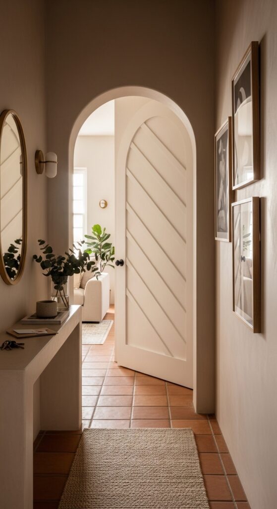
Transition: Creating smooth visual paths between spaces. An arched doorway, a curved sofa, or a runner rug that leads from one room into the next. Transition prevents abrupt visual stops.
Contrast-driven rhythm: Alternating between two different elements. Light and dark cushions on a sofa. Smooth and textured surfaces side by side. This ABABAB pattern creates energy and keeps things from feeling monotonous.
Quick Fix for Rhythm
Pick one color from your room and count how many times it appears. If it only shows up once (say, a bold red chair with nothing else connecting to it), it’ll look random. Add two more touches of that color — a book spine on the shelf, a candle, a throw — and watch it snap into place. Three is the magic number for creating visual rhythm.
4. Emphasis: Every Room Needs a Star
A room without a focal point is like a story without a main character — your eyes don’t know where to look, so they wander aimlessly. That’s the uneasy feeling you get in rooms that seem “okay” but completely forgettable.
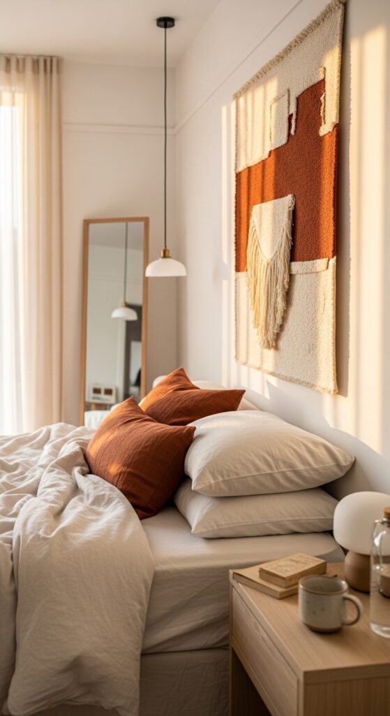
The principle of emphasis says every room needs one dominant feature that anchors everything else. It might be architectural (a fireplace, a bay window, an exposed brick wall), a piece of furniture (a statement sofa, an oversized piece of art), or something you create intentionally (an accent wall, a gallery display, a dramatic light fixture).
How to Create a Focal Point When You Don’t Have One
Not every room comes with a built-in feature. In a plain, boxy room, you have to manufacture emphasis. Here’s how:
- Paint one wall a distinctly different (deeper or bolder) color than the others
- Hang an oversized piece of artwork or a gallery wall — scale matters more than the art itself
- Use a dramatic light fixture. Even a statement floor lamp can serve as a focal anchor
- Position your largest piece of furniture as the visual anchor and arrange everything else around it
Common Mistake
Creating too many focal points. When everything in a room is competing for attention — a bold rug, a bright accent wall, a statement chandelier, and a wildly patterned sofa — nothing stands out. The result feels chaotic instead of curated. Pick one star and let everything else play a supporting role.
5. Proportion & Scale: Why Size Matters More Than You Think
This is the principle that trips people up most often. You fall in love with a gorgeous sectional sofa at the store, bring it home, and it swallows your living room whole. Or you hang a small picture above a large sofa, and it looks like an afterthought. That’s proportion and scale gone wrong.
Scale is about how an object’s size relates to the room. A massive L-shaped sectional works in a spacious open-plan living area. In a 12×12 room, it’s suffocating.
Proportion is about how objects relate to each other. A coffee table should be roughly two-thirds the length of your sofa. Nightstand lamps shouldn’t be taller than the headboard. Wall art should cover about 60–75% of the available wall space above furniture.
The Golden Ratio in Design
The ancient Greeks discovered that a ratio of roughly 1:1.618 creates proportions that feel naturally pleasing. You don’t need to pull out a calculator, but the idea behind the Golden Ratio shows up everywhere in good design: the relationship between a sofa and its coffee table, the height of a bookshelf relative to the ceiling, or the distribution of furniture in an open-plan space.
Practical Proportion Guidelines
| Element | Proportional Rule | Why It Works |
| Coffee Table to Sofa | ~2/3 the length of the sofa | Creates visual connection without overwhelming the seating area |
| Art Above Furniture | 60–75% of the furniture’s width | Feels intentional rather than lost or cramped |
| Rug Under Dining Table | Extend 24–30 inches beyond table edges | Chairs stay on the rug even when pulled out |
| Chandelier Height | 30–36 inches above the dining table | Illuminates without obstructing sight lines or head clearance |
| Curtain Rod Placement | 4–6 inches above window frame, extending 8–12 inches each side | Makes windows (and rooms) appear taller and wider |
Common Mistake
Hanging art too high. The center of a piece of artwork or gallery wall should sit at approximately 57–60 inches from the floor — roughly eye level. Most people hang art at their own standing eye level while on a ladder, which puts it way too high for anyone sitting or standing nearby.

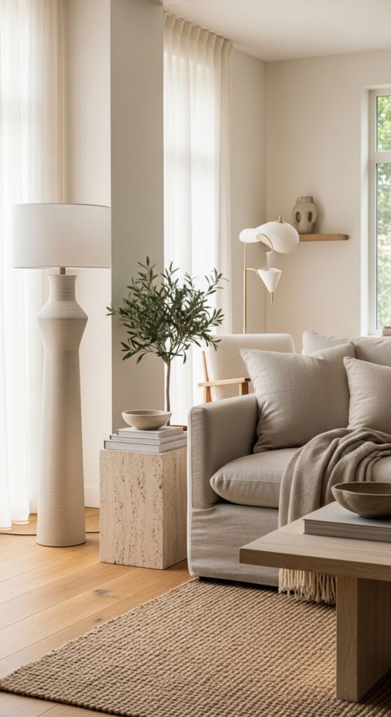
6. Contrast: The Antidote to Boring Rooms
Harmony keeps a room cohesive. Contrast keeps it interesting. Without contrast, even a beautifully harmonious room will feel flat and forgettable — the “boring beige” problem that plagues so many spaces.
Contrast works by placing opposites next to each other to create visual tension and energy. This doesn’t mean clashing. It means strategic differences that highlight each element more effectively.
Ways to Introduce Contrast
- Color contrast: Dark against light (a black-framed mirror on a white wall). Warm against cool (terracotta cushions on a blue-gray sofa).
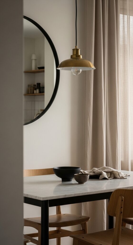
- Texture contrast: Smooth marble against rough-hewn wood. A velvet chair beside a linen sofa. Glossy tiles next to matte painted walls.
- Shape contrast: Round mirrors against rectangular furniture. Curved lamps with angular shelving.
- Style contrast: A sleek modern piece alongside a vintage find. Industrial lighting in a traditionally furnished room.
The Rule of Thumb
A little contrast goes a long way. The most common mistake is going overboard — too many contrasting elements create chaos rather than energy. Aim for contrast in one or two areas per room, and let the rest of the space remain relatively cohesive. Think of contrast as seasoning: essential, but use too much and you ruin the dish.
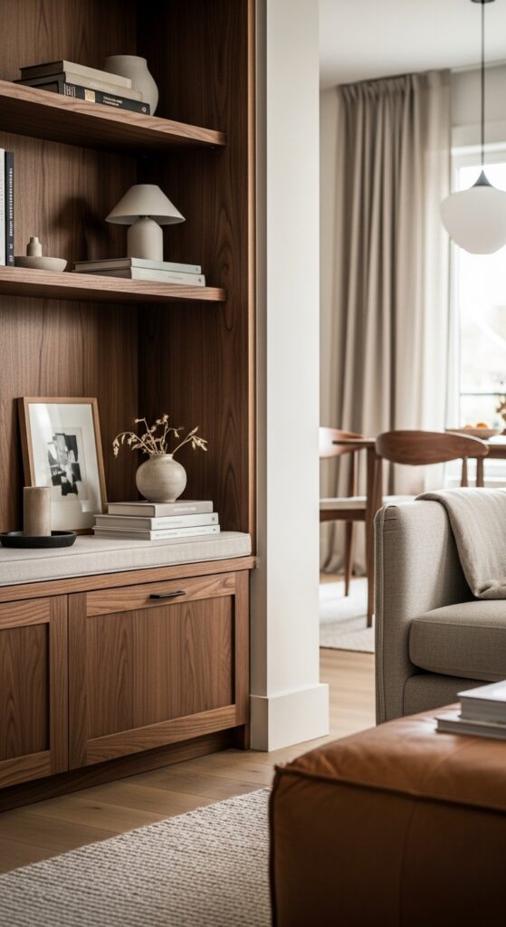
7. Details: Where Good Design Becomes Great
You’ve seen it: a room that follows every principle perfectly but still feels like something’s missing. That missing something is almost always the details.
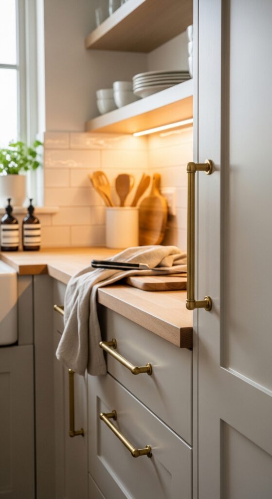
Details aren’t about accessories (though those matter). They’re the layer beneath — the texture of your curtain fabric, the finish on your cabinet hardware, the quality of your light switch plates, the stitching on your sofa cushions. Professional designers obsess over these because they know it’s the difference between “looks nice” and “feels incredible.”
Details That Make the Biggest Impact
- Cabinet and door hardware — swapping cheap, builder-grade handles for brushed brass or matte black pulls transforms kitchens and bathrooms instantly
- Light switch covers and outlet plates — one of the most overlooked and cheapest upgrades
- Textile quality — the weight and drape of curtains, the texture of throw blankets, the weave of your rug
- Edge finishing — piped cushions, hemmed curtains, framed (not just taped) artwork
- Plant life — even a single well-placed plant adds organic detail that softens and enlivens a room
Common Mistake
Neglecting the ceiling (the “fifth wall”). A room with beautifully detailed walls, furniture, and flooring but a flat, white, ignored ceiling feels unfinished. Something as simple as a ceiling medallion around a light fixture, a contrasting paint color, or exposed beams adds a layer of detail that draws the eye up and makes the room feel complete.
The 60-30-10 Color Rule: The Easiest Way to Get Color Right
If there’s one practical formula you take from this article, make it this one. The 60-30-10 rule is how professional designers distribute color without overthinking it. And it works every single time.
60% Dominant Color: This covers the largest surfaces — walls, large area rugs, and major furniture pieces like sofas. It’s your room’s visual foundation. Choose a neutral or soft color you won’t tire of quickly.
30% Secondary Color: This supports the dominant color and appears in medium-sized elements — curtains, accent chairs, bedding, smaller rugs, or painted furniture. It adds depth and interest without competing with your dominant tone.
10% Accent Color: The pop. It shows up in small doses — throw pillows, artwork, decorative objects, a vase, fresh flowers. This is where you can go bold without commitment, and it’s the easiest element to swap when you want a quick refresh.
Real-world example: Soft white walls and a light gray sofa (60%), navy blue curtains and a textured navy throw blanket (30%), mustard yellow cushions and a brass table lamp (10%). Clean, cohesive, and instantly elevated.
This ratio directly supports the principles of balance, harmony, and contrast simultaneously. The dominant color provides unity, the secondary adds depth, and the accent creates emphasis and contrast. One rule, three principles addressed.
Interior Design Elements vs. Principles: What’s the Difference?
This is one of the most commonly confused distinctions in interior design basics, and understanding it will give you a massive advantage over most DIY decorators.
Elements are the building blocks — the raw materials you work with. They include space, line, form, light, color, texture, and pattern. These are tangible things you can point to in a room.
Principles are the guidelines for how to arrange those elements. Balance, harmony, rhythm, emphasis, proportion, contrast, and details tell you how to combine the raw materials effectively.
Here’s the simplest analogy: elements are your ingredients (flour, eggs, butter, sugar). Principles are the recipe (how much of each, in what order, and why). You need both. Great ingredients with no recipe gives you a mess. A great recipe with bad ingredients gives you mediocrity.
When a room feels “off,” you can often diagnose it by asking two questions: “Do I have the right elements?” and “Am I combining them according to the principles?” Usually, the elements are fine — it’s the principles that need adjusting.
Room Diagnostic: How to Spot What’s “Off” in Any Room
This is the framework no other interior design guide gives you. The next time a room feels wrong but you can’t figure out why, walk through these seven questions:
| Principle Check | Ask Yourself… | If the Answer Is No… |
| Balance | Does the visual weight feel evenly distributed? Squint and check. | Move a large or dark object to the “lighter” side of the room. |
| Unity | Does every piece feel like it belongs? Is there a connecting thread? | Identify the outlier and replace it, or add a bridging element (a throw, a cushion) that ties it in. |
| Rhythm | Does your eye flow through the room, or does it get stuck or jump around? | Repeat a key color or texture in at least 3 places across the room. |
| Emphasis | Is there one clear focal point? Do you know where to look first? | Create one: hang a large piece of art, add an accent wall, or rearrange furniture around an anchor. |
| Proportion | Do objects feel right-sized for the room and for each other? | Swap oversized items for something scaled to the space, or add vertical elements if things feel squat. |
| Contrast | Is the room interesting, or does everything blur together? | Add one opposing element: a dark frame on a light wall, a textured pillow on a smooth sofa. |
| Details | Does the room feel finished? Are the small elements quality and intentional? | Upgrade one category of detail: hardware, textiles, or lighting fixtures. |
Print this out or save it on your phone. The next time you’re redecorating, walk through your room with these seven checks and you’ll find the issue within minutes.
Applying Interior Design Principles in Small Spaces and Rentals
One of the most common frustrations is applying design principles when you’re working with limited space, limited budget, or limitations on what you can change (hello, rental agreements). The good news: every principle still applies. You just need to adapt your approach.
Small Space Adaptations
- Balance: Use vertical balance instead of horizontal. When floor space is limited, draw the eye upward with tall shelving, vertically hung artwork, or high-placed curtain rods.
- Unity: A strict, limited color palette (2–3 colors max) is even more important in small spaces. Too many colors make a small room feel chaotic.
- Rhythm: Use one repeating element consistently. In a studio apartment, the same warm wood tone appearing in your desk, bed frame, and shelf creates flow without clutter.
- Emphasis: Choose one focal point and commit. In a small room, multiple statement pieces compete and shrink the perceived space.
- Proportion: Scale down everything by one size. The coffee table, the artwork, the rug — all should be slightly smaller than you think. Negative space (empty space) is your best friend in compact rooms.
- Contrast: Use it sparingly but strategically. One high-contrast element (a dark accent wall, a bold piece of art) adds drama without overwhelming.
- Details: Invest in quality over quantity. Three beautifully curated objects on a shelf beat ten random decorative items every time.
Renter-Friendly Fixes
Can’t paint? Use large-scale removable wallpaper for an accent wall. Can’t change hardware? Add peel-and-stick overlays to cabinet fronts. Can’t install lighting? Floor lamps and plug-in wall sconces create layered lighting without touching a single wire. Every principle can be applied with zero permanent changes.
What to Do When Design Principles Seem to Conflict
Here’s something no one tells beginners: these principles can pull in different directions. Emphasis encourages you to create a bold focal point, but too much emphasis can throw off balance. Contrast adds excitement, but too much contrast undermines harmony. So how do you prioritize?
The Priority Stack
When in doubt, address them in this order:
- Proportion & Scale first — If things are the wrong size for the room, nothing else will fix it
- Balance second — The room needs to feel stable before you add excitement
- Unity third — Establish a cohesive foundation
- Emphasis fourth — Now anchor the room with a focal point
- Rhythm fifth — Create visual flow between elements
- Contrast sixth — Add energy and interest
- Details last — The finishing layer
Think of it like building a house: you need the structure (proportion, balance, unity) before the decoration (emphasis, rhythm, contrast, details). Trying to add excitement to a room that has fundamental sizing or balance issues is like hanging curtains in a house with no walls.
Frequently Asked Questions About Interior Design Principles
Q1: What is the most important principle of interior design?
Answer: Balance is arguably the most foundational. A room can survive without a clear focal point or deliberate rhythm, but a room that feels lopsided or visually unstable is immediately uncomfortable. Start with balance, and the other principles become much easier to implement.
Q2: How many principles of interior design are there?
Answer: The widely accepted framework includes seven principles: balance, unity/harmony, rhythm, emphasis, proportion and scale, contrast, and details. Some design schools add functionality and sustainability as additional principles, but the core seven cover the vast majority of what you need to create a well-designed space.
Q3: Can I break these rules?
Answer: Absolutely — once you understand them. The best designers break rules intentionally. An oversized light fixture in a small room can create a stunning, unexpected focal point. An all-white room technically lacks contrast, but can feel serene and intentional. Breaking rules works when you know which rule you’re breaking and why. It doesn’t work when you’re breaking rules you didn’t know existed.
Q4: Do these principles work for every design style?
Answer: Yes. Whether your style is mid-century modern, boho-eclectic, Scandinavian minimal, traditional, or maximalist, these same seven principles apply. A minimalist room uses fewer elements but still needs balance, proportion, and a focal point. A maximalist room has more elements but still requires rhythm, unity, and intentional contrast to avoid feeling like clutter.
Q5: How do I apply interior design principles on a tight budget?
Answer: The most impactful changes cost the least. Rearranging furniture for better balance costs nothing. The 60-30-10 color rule can be achieved with a £30 set of cushions and a few accessories. Upgrading cabinet hardware runs around £20–£50 and creates an outsized impact on the details principle. Start with rearranging, then add inexpensive accent elements before investing in big-ticket items.
Your Next Step: Walk Through Your Room Tonight
You now have something most people don’t: the exact framework professional designers use to create rooms that feel effortlessly polished. The seven interior design principles aren’t abstract theory. They’re practical tools.
So here’s what I want you to do tonight: pick one room. Stand in the doorway. Walk through the seven-point diagnostic above. Identify the single biggest principle that’s being violated. Then take one action to fix it.
Maybe it’s pulling a chair away from the wall to improve balance. Maybe it’s adding a third touch of a color that currently only appears once to create rhythm. Maybe it’s finally hanging that piece of art you’ve been meaning to put up to give the room an anchor.
You don’t need to overhaul everything at once. One principle, one fix, one room at a time. That’s how every professionally designed space gets built.
And the next time someone walks into your room and says, “This place just feels so put together” — you’ll know exactly why.

Albert Max is a home design specialist with a passion for functional living spaces. He focuses on basement transformations, kitchen design, and living room aesthetics, helping homeowners unlock the full potential of every square foot. Albert believes that thoughtful design is not about luxury — it’s about creating spaces that work beautifully for real life.